A story-driven landing page for an app that gets you off your screen
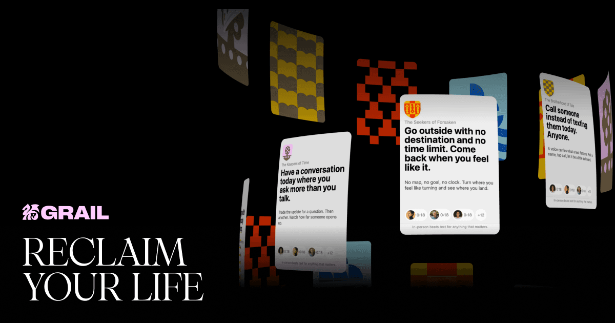
Grail is an app that hands you one real-world quest a day and grows four stats as you complete them. We built its pre-launch landing page: an eight-chapter story that explains the product and fills the waitlist.
01Challenge
Grail is a gamified app that doesn't try to keep you hooked. It gives you one real-world quest a day, and each one you finish raises one of four stats: Strength, Intellect, Charisma or Wisdom. When you graduate, your subscription cancels itself.
The product is still in development, so the site had to do its job before launch. It needed to explain an unusual idea, show the brand's character and sign up people who want in on the first wave. There were no reviews or usage numbers to point to yet, so the storytelling had to carry the whole case.
Tone mattered just as much. The page speaks to people who are tired of screens, and it couldn't feel like one more feed you scroll out of habit.
02Solution
We structured the landing page like a book, in eight numbered chapters. Each one answers a single question and moves the visitor from the problem to the waitlist.
- Hero: "Reclaim your life", the product in one line, and a Join Waitlist button
- Chapter 01, the problem: everyone's out living while you watch them on a screen
- Chapter 03, the journey: what tends to happen once you start showing up, with no promises attached
- Chapter 04, voice feedback: a voice note after each quest, for your future self and the seekers who come after
- Chapter 05, totems: six characters with distinct personalities, such as Duck the Knight
- Chapter 06, stats: how quests add up to strength, intellect, charisma and wisdom
- Chapter 07, guilds: communities built around one theme that you can join or start
- Chapter 08: early-access sign-up
The visual language uses large full-bleed type and full-screen sections. The totems, each with a short, wry description, give the brand a voice that sets it apart from sterile productivity apps.
The site is hand-coded, with no page builder. Meta tags and Open Graph describe the product as plainly as the page does, so shared links look clean in search results and messengers.
03 · Result
8
chapters in the landing page story
Contact usKey metrics
04
- 8
- chapters in the landing page story
- 6
- totem characters
- 4
- stats that grow with each quest
- 1
- quest a day
Gallery
04 screens · Click to enlarge
Have a similar project?
Tell us about your product — we'll estimate the timeline and cost within a day.