Website UX Audit: How to Find Out Why Users Aren't Buying
Website UX audit
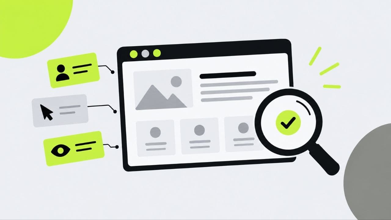
A website can have a modern design, good advertising and a steady stream of visitors — and still get almost no leads.
When this happens, many businesses start rewriting their ads, cutting prices or rebuilding the site from scratch.
But the problem may be much closer to home: the site is simply inconvenient for people to use.
They can't tell where to click. They can't find the product they need. They can't see the price. They don't trust the payment page. They can't fill in a form on their phone properly.
Each of these problems seems minor. But when dozens of such small issues add up along a single user journey, the business loses customers.
Finding these problems is exactly what a UX audit is for.
What a UX audit is, in plain terms
A UX audit is a systematic review of how easy a website is to use and how effectively it leads people to the desired outcome.
The specialist looks at the site not through the eyes of the business owner, and not just through the eyes of a designer.
The key question is different: "Can an ordinary user quickly make sense of the site, find the information they need and do what they came to do?"
Depending on the project, the target action might be:
- a purchase
- submitting an enquiry
- booking a service
- a phone call
- signing up
- placing an order
- requesting a consultation
A UX audit helps you find the points where people might stall or leave.
Why a beautiful website can sell poorly
One of the biggest mistakes is assuming that good design and good UX are the same thing.
They're not.
A beautiful website might have:
- striking animation
- unusual typography
- expensive photography
- complex visual effects
- an original colour scheme
But if visitors can't tell what's being sold, where to see the price or how to place an order, visual appeal won't save the project.
Good UX makes an interface clear, predictable and convenient.
Users shouldn't have to figure out how the site works.
They should simply be able to get their task done.
Where websites most often lose customers
Most problems don't arise in one specific place.
The user goes through a sequence:
ad → landing page → exploring the offer → making a choice → enquiry or purchase.
At every stage, there's a chance to lose them.
The first screen
Within the first few seconds, a visitor should understand:
- what the company offers
- whether the offer is right for them
- why they should keep reading
- what action they can take
If instead they see an abstract slogan like "Building next-generation solutions", they have to work out for themselves what the company actually does.
That's unnecessary cognitive load.
Navigation
Users shouldn't have to study the menu like a subway map.
If the service they need is tucked away in an unexpected section, they may simply never find it.
This is especially critical for online stores and large corporate websites with lots of pages.
Forms
A complicated form is one of the most obvious sources of lost customers.
If someone just wants a consultation, why ask them right away for their job title, company name, budget, address and a detailed description of the task?
The less information you truly need at the first stage, the easier it is for the user to take that first step.
Product or service page
Users need enough information to make a decision.
If there's no price, specifications, timelines, terms, photos or answers to the basic questions, they have to look for that information elsewhere.
And very often, that "elsewhere" turns out to be a competitor's website.
Checkout
This is a particularly sensitive stage.
The user has already decided to buy, but runs into:
- mandatory registration
- unclear delivery costs
- unexpected extra charges
- too many fields
- form errors
- an inconvenient payment process
As a result, the business loses a customer who was practically ready to buy.
A UX audit is more than just "taking a look at the site"
A professional audit is different from a subjective opinion.
When hunting for specific problems, it's essential to get to the bottom of the "little things":
what job a given button does → how easy it is to notice → whether the user understands its purpose → what happens after the click → where users drop off.
That's why a good audit combines several approaches.
1. Expert review
2. User behaviour analysis
3. Competitor comparison
4. Mobile version testing
Today, it's not enough to test a site on a desktop computer alone.
On a smartphone, almost everything changes:
- screen size
- how people navigate
- element layout
- input method
- button visibility
- how pop-ups behave
What's convenient on a large monitor can turn out to be extremely awkward on a phone.
That's why the key user scenarios need to be tested on an actual mobile device.
Most importantly, a good UX audit doesn't end with the phrase "this is inconvenient".
It should deliver a clear plan:
where the problem is → why it occurs → how important it is → what to change → how to measure the result.
That's when UX stops being a matter of taste and becomes a tool for growing the business.